A European cafe, with its outdoor seating, encourages would-be visitors to relax, think, and converse. Like a Van Gogh painting, they create a mood that begins an experience. And it all starts with that first view of the cafe. “You never get a second chance to make a first impression,” as the saying goes—which applies to everything from cafes to your developer product’s homepage.
Though visitors often enter from other pages, most will check out the top-level page to see what you’re all about. For developers, this first impression is when they’ll decide if you’re serious about technical audiences.
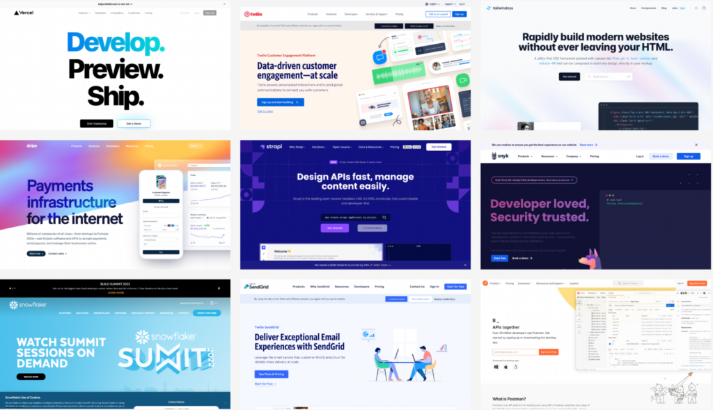
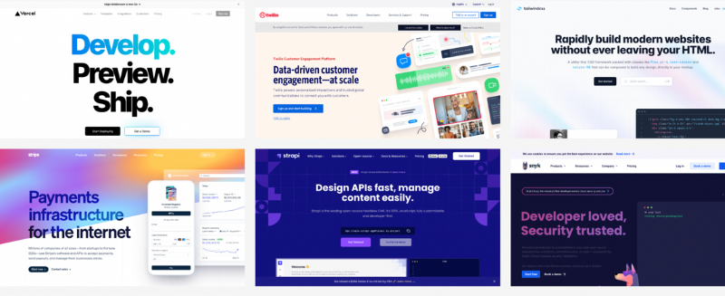
At EveryDeveloper, we see a lot of developer products—and their homepages. We maintain an expanding gallery of great developer examples. Everything on these homepages sends signals to developers, both good and bad. Do they focus on technical problems or hand-wavy world-changing platitudes? Is documentation given top-billing, or is it relegated to the footer… or worse? Developers may not ask these questions directly, but they instinctively search your site for the answers.
In this post, we’ll pull out some patterns from 30 of the best developer products. Among the highlights:
-
- 54% of the top homepages mention developers or documentation in global navigation
-
- The three most popular navigation titles are Pricing (83%), Products (70%), and Resources (57%)
-
- Almost half of the homepages discuss business problems before developer problems
-
- Only a handful highlight support (4), contact (2), or open source (2) in global navigation
By looking at the group as a whole, these patterns can help you identify both best practices and opportunities to over-deliver for developers. To start, we’ll look at the first thing a developer notices when the homepage loads: the primary page headline—your opportunity to capture their attention.
Most Reference Developers in Their Messaging
Have you ever walked into a cafe or other business and stood around waiting for someone to notice you? You’re standing at the counter, the staff on the other side… but it takes an awkward amount of time for them to acknowledge your presence. That’s the feeling of being a developer browsing a supposed technical product without a reference to those who are required to implement the tool.
Some of these homepages have direct, developer-friendly messages that make their audience clear. Others attempt to describe the business benefit of its product—something we often recommend to our clients. In those cases, you can often find a little head nod to the developers, such as a mention of building, documentation, or APIs.
But it’s the first group, the ones that come right out and say it, that stand out the most.
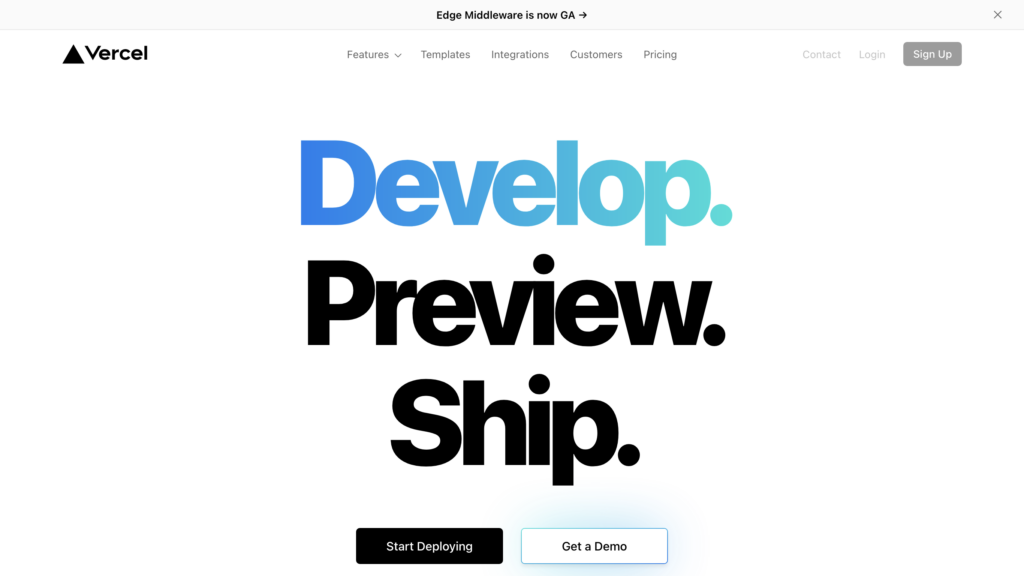
For example, Vercel leads with a simple message, written in the equivalent of 128-pixel font: “Develop. Preview. Ship.” This homepage is not trying to thread the needle with its audience. A “start deploying” button closes off the hero, along with a mention of Vercel’s enablement of “frontend teams.” With all that developer goodness, they can be forgiven that the secondary button goes to their sales team.
Here are a few other clear developer-focused messages:
-
- Developer loved, Security trusted (Snyk)
-
- Rapidly build modern websites without leaving your HTML (Tailwind CSS)
-
- Serve Web Apps with one command (ngrok)
How about developer experience darlings Stripe and Twilio? While you might expect the best examples to come from these players, both of these companies have multiple products and audiences competing for homepage attention.
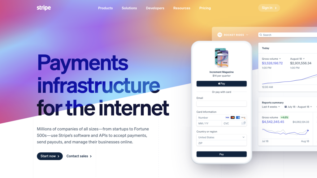
The original Stripe homepage is a better example of a dev-focused message. Now it must tell a broad-reaching story of how the pieces fit together. “Payments infrastructure for the internet” becomes the common theme. However, a company like Stripe knows it needs to have an answer for developers, which is why it also includes “APIs to accept payments” as part of the first message on its homepage.
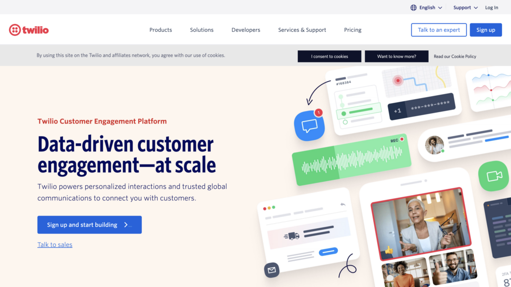
Often spoken in the same sentence as Stripe, Twilio has also expanded from the voice API it initially launched in 2008. Over the years, its developer focus has spread to other personas, as the company realized its software solves marketing problems. The primary message on Twilio’s 2022 homepage does not reference developers at all: “Data-driven customer engagement.”
As a developer scrolls, they’ll see implementation details that show they’re in the right place. What if their entire first impression is above the fold? Twilio, Stripe, and many other dev-focused companies provide a signal to developers right in their global navigation.
Inspiration to Reach a Technical Audience
Your homepage speaks volumes before a dev reads a single doc. Subscribe for weekly strategies and real-world examples that help you craft messaging and navigation that developers recognize, trust, and act on.
Developers Get Global Navigation Treatment
Sometimes you enter a cafe at a busy time. There’s a line of other customers. Even a slight head nod from the staff behind the counter can make the difference between sticking around and heading out the door. For developers browsing your homepage, your navigation acts as that head nod. In fact, it can guide developers toward their implementation journey.
The developer portal or documentation is where questions are answered definitively (and, if not, it’s another place you’ll lose a technical audience). It’s one thing to make a promise on the homepage. Do the technical details back it up? Developers want an opportunity to evaluate for themselves.
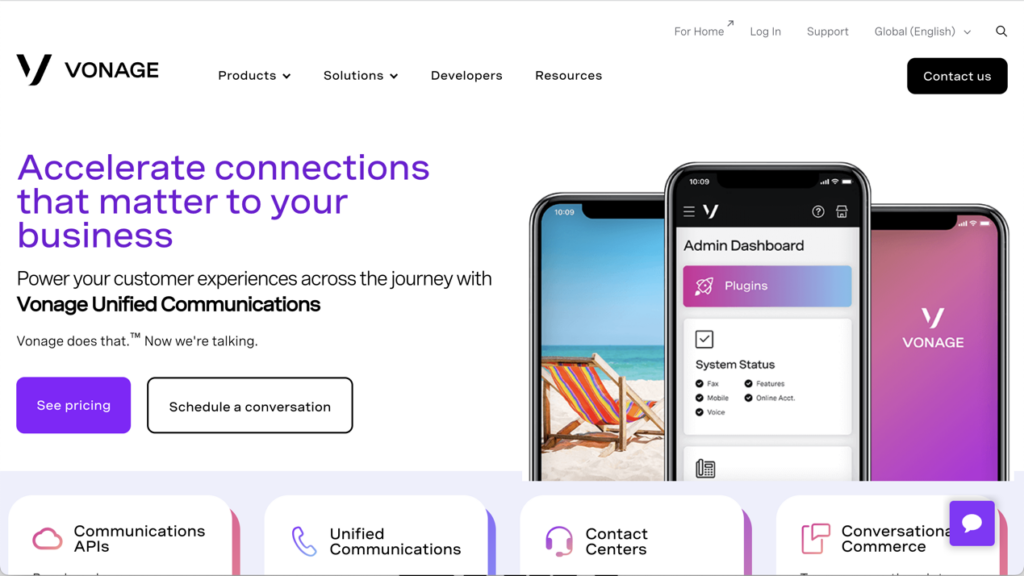
Out of the 30 homepages we reviewed, 16 provide global navigation that highlights these technical details:
-
- Developers (8)
-
- Docs (5)
-
- Documentation (3)
Some companies include links to dev or docs sites within a dropdown menu, which requires developers to browse beyond the top-level scan. At first glance, it might not look like technical details are shared at all.
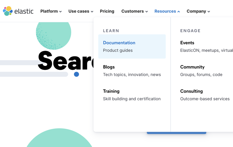
Other companies use other terms which may imply technical details:
-
- Platform (5)
-
- Community (2)
-
- Open Source (2)
It’s possible some have excluded developers from the navigation because the entire site is dedicated to a technical audience. GitHub, for example, does not have any of these developer terms in its global nav, but the company is definitely dev-focused. Still, our experience suggests it’s good practice to clearly point developers to the technical details. One-third of the homepages we reviewed have rich dropdowns below their developer or documentation menu items.
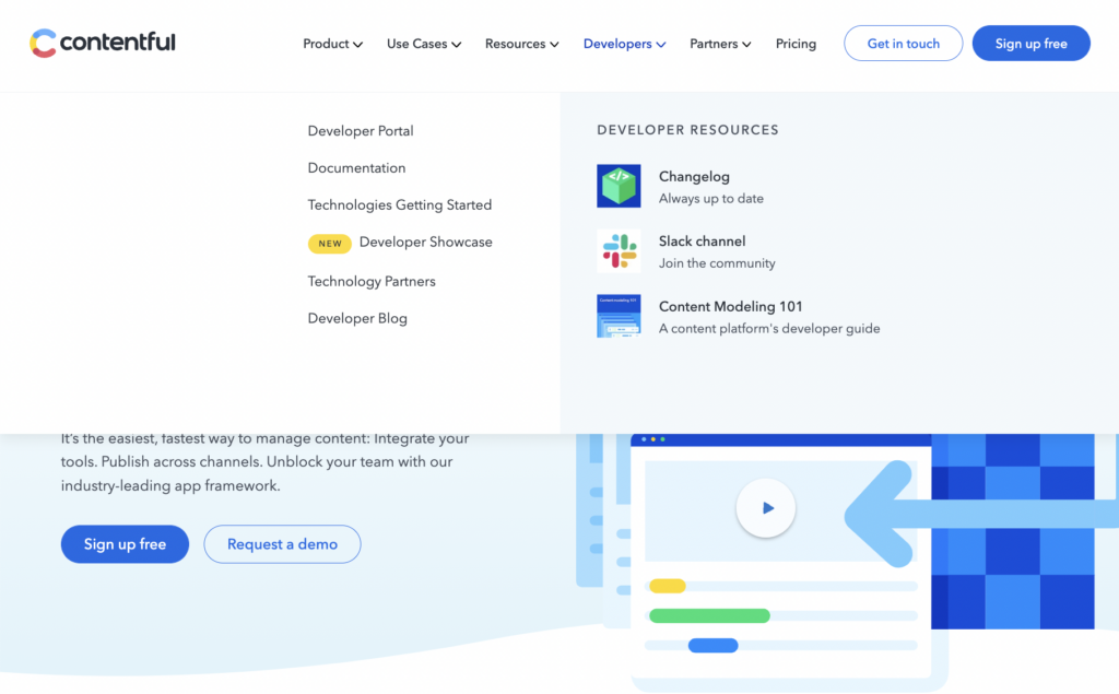
For example, Contentful’s “Developers” menu includes links to its portal, documentation, and other pages that help developers understand its product. There’s even a menu item for one of the most important documentation pages, a language-focused getting started experience.
There are more than technical details to be found within the global navigation. In fact, three other nav titles are more common.
Pricing, Products, and the Dreaded “Resources”
While waiting in line at a cafe, you might ponder just how far someone can take a metaphor. Indeed, at EveryDeveloper, we notice developer experience at every coffee shop, store, and street corner. Most cafes have a prominent menu, which lists each product and its corresponding price. The developer company homepages in this study take a similar approach.
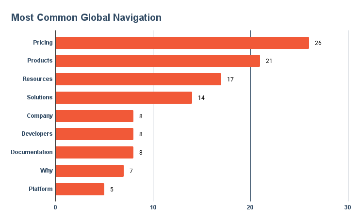
Almost every site included pricing in its global navigation. In our experience viewing analytics from many dev tool companies, pricing is among the most popular navigated pages. Though developers must answer technical questions on your site, they still care about “business” topics. How likely are they to recommend a tool when they don’t know what it will cost?
Of the four companies that don’t include pricing in the global navigation, one is open source (Tailwind CSS), two have an enterprise focus (Okta and Snowflake), and the other (Vonage) shows pricing on product pages. All of these companies could benefit from a pricing page to help developers gauge whether they can even try the tools without payment or conversation.
Product pages are the second-most common nav item in the 30 homepages we reviewed. Content meant to attract developers (like blog posts, tutorials, and guides) should make minimal reference to your product. Instead, put your product focus on these product pages. Like other content, you want to frame your product around the developer problems it solves. But you’ll be forgiven for listing features on a product page—developers will appreciate a little about what your product does.
On the other hand, the resources section (present in over half of our sample) is often a dumping ground for miscellaneous content: white papers, case studies, the blog (only linked globally 10% of the time), and even documentation.
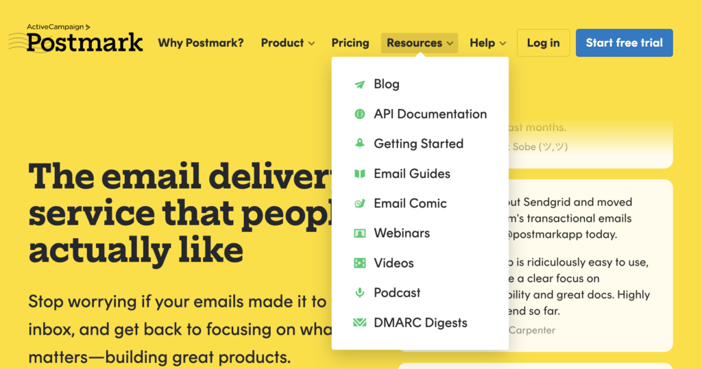
Resources as global navigation is clearly a favorite of developer marketers, but we think it’s an anti-pattern. The “resources” the developer audience might care about belong in other sections of your site. Instead, resources house the content that you care about. It’s sometimes used as an internal bargaining chip or a place to avoid thinking more completely about the developer journey.
We admit this could be our own pet peeve, but we’ve experienced enough of the side effects to know the issues with resources are real. It’s hard to admit that some content is more important than others when it comes to global navigation. But it’s important to do the work to determine how else the resources content can be discovered. Often it’s a sign you need to examine your developer content strategy.
Discover Your Own Patterns
Most cafes can handle the occasional special order. Perhaps you want a condiment added or removed. Once you’re at the counter, it’s your turn. In this post, we’ve shared our own analysis of these 30 developer company homepages. We’ve also shared the raw materials, via our Developer Company Examples Gallery. Click around or use your arrow keys on your desktop to scroll full-screen. You’ll surely find patterns you can use in your own work.
When you’re ready for our team to aim our analysis at your site, documentation, or developer content… place your order with EveryDeveloper.
Inspiration to Reach a Technical Audience
Your homepage speaks volumes before a dev reads a single doc. Subscribe for weekly strategies and real-world examples that help you craft messaging and navigation that developers recognize, trust, and act on.
