Make a list of developer stereotypes and caffeine would certainly be involved. Coffee and coding seem to go together. Perhaps that’s why trips to the coffee shop remind me of developers and many EveryDeveloper Weekly emails have included these anecdotes.
It turns out, there’s a lot your local coffee shop can teach you about dev experience: from how options are constructed on a menu, to how newcomers are treated, and even the importance of transparent bagel stock. Your own caffeination deviation can turn into on-the-job research if you know where to look. And you can start with an examination of your regular drink order.
Coffee Shop Menus Are Not an API Reference
The options at a coffee shop are not complex: Drip, espresso, or tea. Then choose a style, a size, and some optional modifications. Though simple choices, it’s notable that every coffee shop menu provides some pre-arranged drink options. Indeed, even if you have an order that’s not listed, there’s a name for what you want.
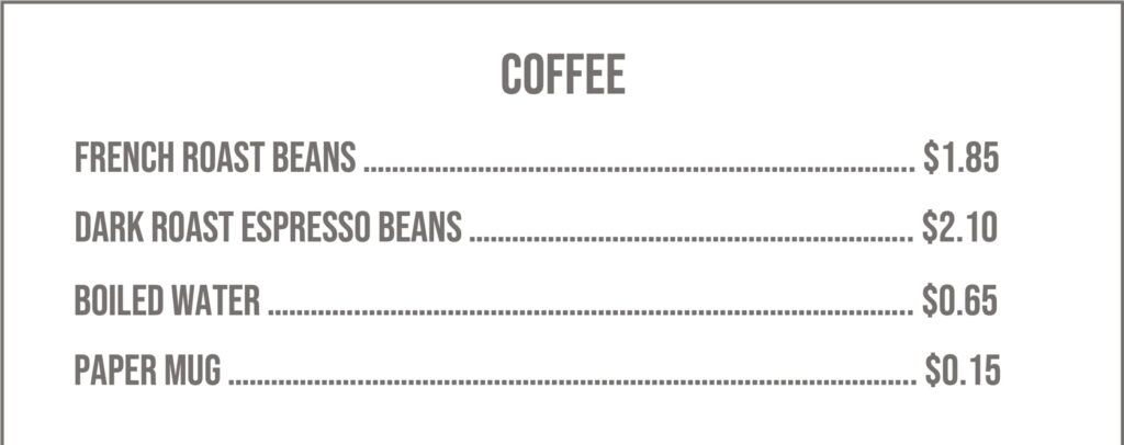
You’ll never see a coffee menu like this:
It would be silly to expect you to list out the ingredients for your drink… especially if you haven’t had caffeine yet. Coffee shops prearrange these ingredients into packaged orders that have everything already combined. In other words, they understand your use case and put that in front of you.
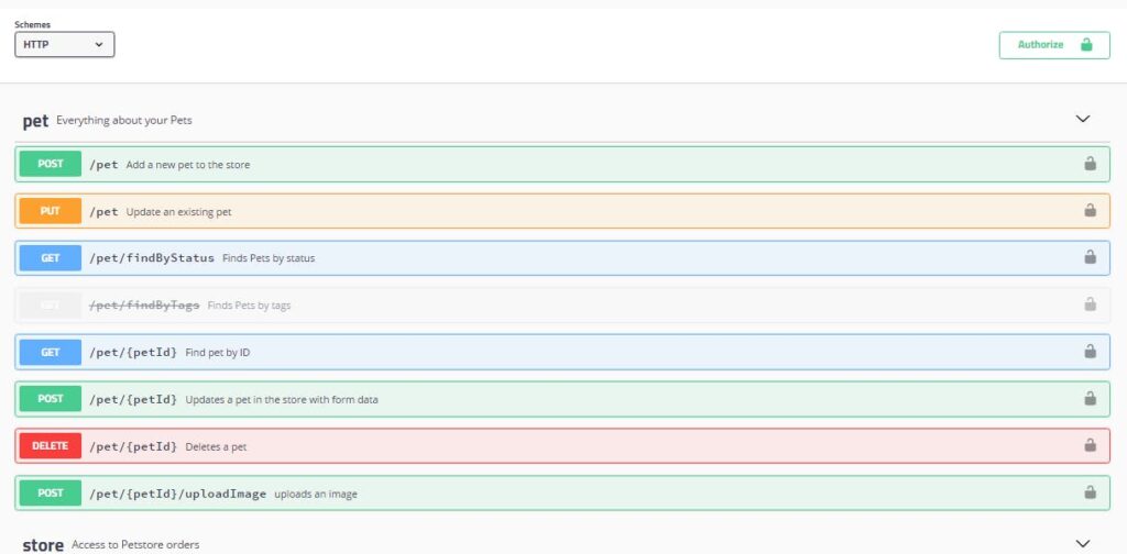
So, why do most API docs look like this?
An accurate reference is important (it’s #8 of the 13 developer experience criteria), but it’s an unlikely starting place for developers who need to understand why an API matters. You can’t see this from what is essentially a list of ingredients.
The following are far more effective for initial usage:
- Use cases
- Examples of popular calls
- Sample apps
- The humble getting started tutorial
And yet… the API reference is the classic first piece of documentation. What if we adopted an Amazonian principle of working backwards? Before Amazon creates a new product, they imagine the press release. Well, they don’t just imagine it, they write it. It becomes the beacon for the work to build the product.
Try writing a getting started tutorial (DX criteria #2) for a developer product that is not complete. Perhaps that might inform how it’s built. The worst case is you know a developer would never have to struggle to figure out how the ingredients can be combined. No coffee shop menu—nor API documentation—should just be a list of raw materials. Just as no bagel store should gate-keep the status of their products.
Status Pages and Bagel Experience (BX)
While not a beloved caffeinated drink, bagels go hand-in-hand with a morning cup of joe—and they’re surprisingly related to the dev experience.
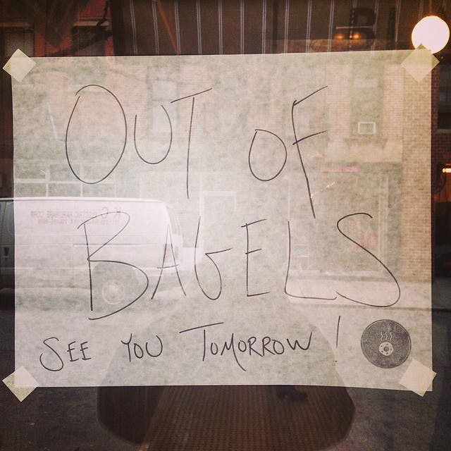
The best-rated bagel stores often include long lines where the only thing to do is stare at their signs. At one popular place in Portland, Spielman Bagels, their most visible sign at the front says
WE ARE OUT OF:
and then they add flavors to the board as they run out.
If you go early enough, this sign will be empty. They have every flavor available. It’s easier to keep that board up than take it down in this blank state. While it may seem like a waste, it serves a key purpose.
That empty board is like an API status page (the 7th of the DX criteria) when systems are operational. You want a place to share any downtime or other errors with developers when they happen. In moments of crisis, developers want accurate communication about issues. They want to confirm what their monitors tell them and ensure that you know what’s happening.
Assuming your service is reliable, that status page will nearly always show the system as available—the equivalent of Spielman starting the day with full buckets of bagels.
That sign at the bagel shop is important, even at the beginning of the day. It tells people that this isn’t the sort of place that will let you stand in a line to find out your favorite bagel is sold out.
Your status page isn’t just to show downtime. It tells developers you’re the sort of company that is transparent about service interruptions. You’re prepared to give them the details they’ll need in those frustrating moments of downtime. And you’ll never forget these factors in developer experience if you frequently look at your API like it’s the first time.
Time to First Hello Coffee
You can’t deny the “curse of knowledge” is real. For example, let’s say there was a pandemic that caused coffee shops to shut down indoor operations. Instead of their usual calm and orderly service, you were forced to wait for your caffeine in a long line going down the block. As a regular, you want to declare your order, get your drink, and go. But the person in front of you, after a 10-15 minute wait in line, doesn’t know what to order. You might have to stop yourself from yelling SIR, THIS IS A COFFEE SHOP! IT’S NOT THAT HARD!
But the makeshift window service was set up for regulars, which means the inside menu isn’t visible from the sidewalk. How can first-time visitors be expected to know? This empathy is hard before your first coffee of the day. And even with caffeine it’s easy to forget what a first-time visitor to your developer site experiences.
If you’re only providing developers a list of ingredients and you lack a status page, what other “facepalm moments” are you missing with your developer experience?
Do you have:
- Libraries in popular languages (#1)
- A self-serve option (#3)
- A clear pricing page (#4)
- A free tier or trial (#5)
- An obvious place for questions (#6)
How can you put yourself in the mindset of someone visiting for the first time?
We’ve shared numbers 1-8 of the 13 dev experience criteria. Read more about how developer experience impacts the entire journey. And if you’re struggling to see with fresh eyes, our well-caffeinated team can help quantify how you measure up against an ideal developer experience.


